Phase 1
Understand
Desktop research on major appliance manufacturers and on the apps used to control their products, plus best practices pulled from actually using them.
IoT · Design challenge · 2020
A mobile app to pair and control connected appliances. The brief said kitchen; I argued for the whole house, and the architecture follows from that one decision.
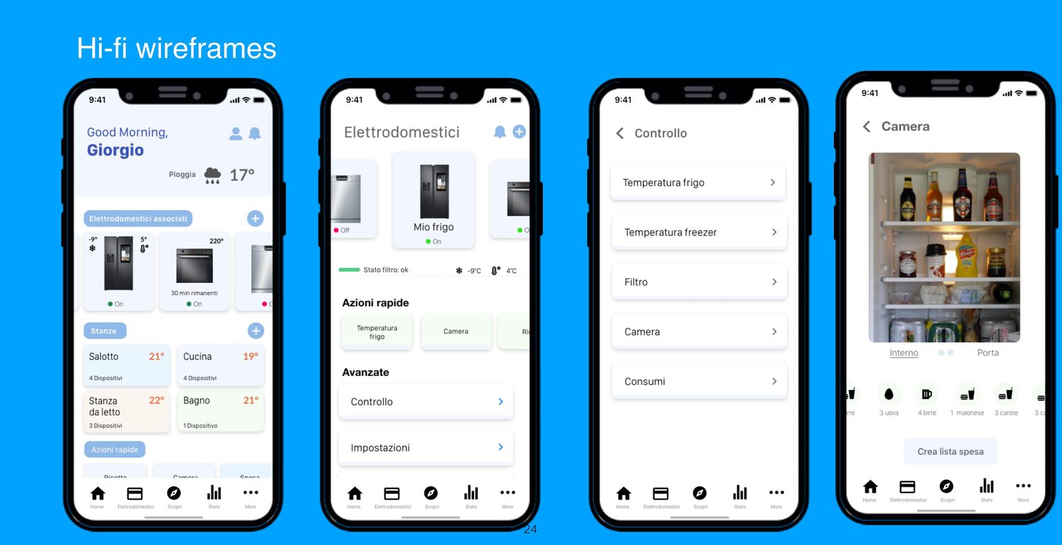
Design a mobile app to manage smart kitchen appliances within an IoT ecosystem — fridge, oven, dishwasher — and deliver three or four screens covering the navigation logic, the pairing of an appliance, and the screen used to control it.
Three screens is not much room. Which makes the interesting question not what to draw, but what to decide first.
Phase 1
Desktop research on major appliance manufacturers and on the apps used to control their products, plus best practices pulled from actually using them.
Phase 2
Insights turned into requirements, hand sketches to test options, and a draft information architecture.
Phase 3
Lo-fi wireframes of the onboarding and pairing flow, then a visual direction: moodboard, palette and typography.
This was a design challenge, so the research focused on existing products rather than primary user research.
I downloaded and used the apps of four manufacturers rather than looking at screenshots, taking the fridge as the reference appliance. Each one was assessed on the same grid:
The useful part wasn't the feature comparison. It was noticing that the apps differ most in how they behave when pairing fails, and in whether they let you look around before creating an account.
The requirements that came out of it, in the order they mattered.
01
Step-by-step association with representative images — and, when the scan finds nothing, a manual route: search by brand or model, or enter the network parameters by hand.
02
A demo mode to navigate the app without registering, then quick registration, and re-entry with a PIN or face recognition.
03
Appliances belong to rooms — the kitchen contains the fridge, the oven, the hob. That's how people describe their home, so that's the model.
04
The home screen as a customisable dashboard: the most frequent actions, the status of what's running, key values at a glance.
05
Monitoring that helps with saving money and using less — one of the few things that gives an appliance app a reason to be opened twice.
06
Clear descriptions of what each appliance can do, and fast support through chat rather than a phone number.
Decision 01
The brief asked for the kitchen. I designed one step up: the home. If the premise is a smart home, the connected devices aren't only in the kitchen — and a single app that holds the whole ecosystem is plainly more useful than one app per room.
The trade-off: a wider scope than the brief, with more to justify. I made the reasoning explicit rather than quietly expanding the request.
Decision 02
The research showed both models in the market: apps locked to one manufacturer, and apps that pair appliances from several. The architecture assumes the second — adding an appliance by brand or model is part of the main flow, not an edge case.
The trade-off: harder to build and to support, and it forces functionality to be described per appliance rather than assumed.
Decision 03
Frequent actions get promoted to the home and configured in settings, and a Discover section carries suggestions. The system can learn from routine and propose settings, with an assistant for questions about functions.
The trade-off: personalisation that has to earn its place, or it becomes another screen nobody customises.
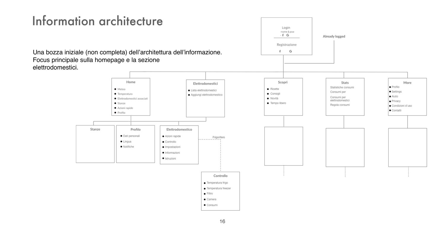
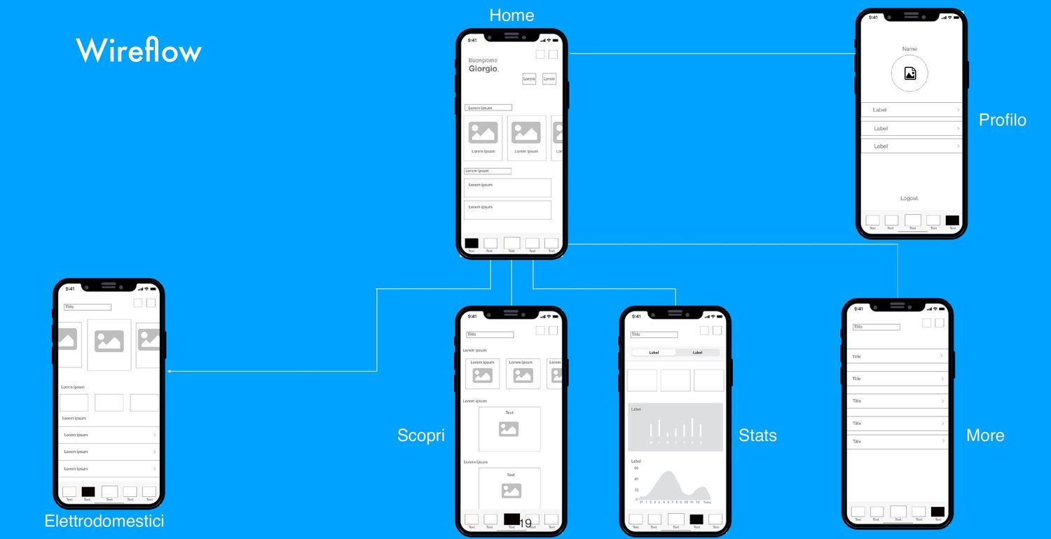
Five sections after login: Home, Appliances, Discover, Stats, More. The appliance is the pivot — from it you reach quick actions, control, settings, information and instructions; control is where temperature, freezer, filter, camera and consumption live.
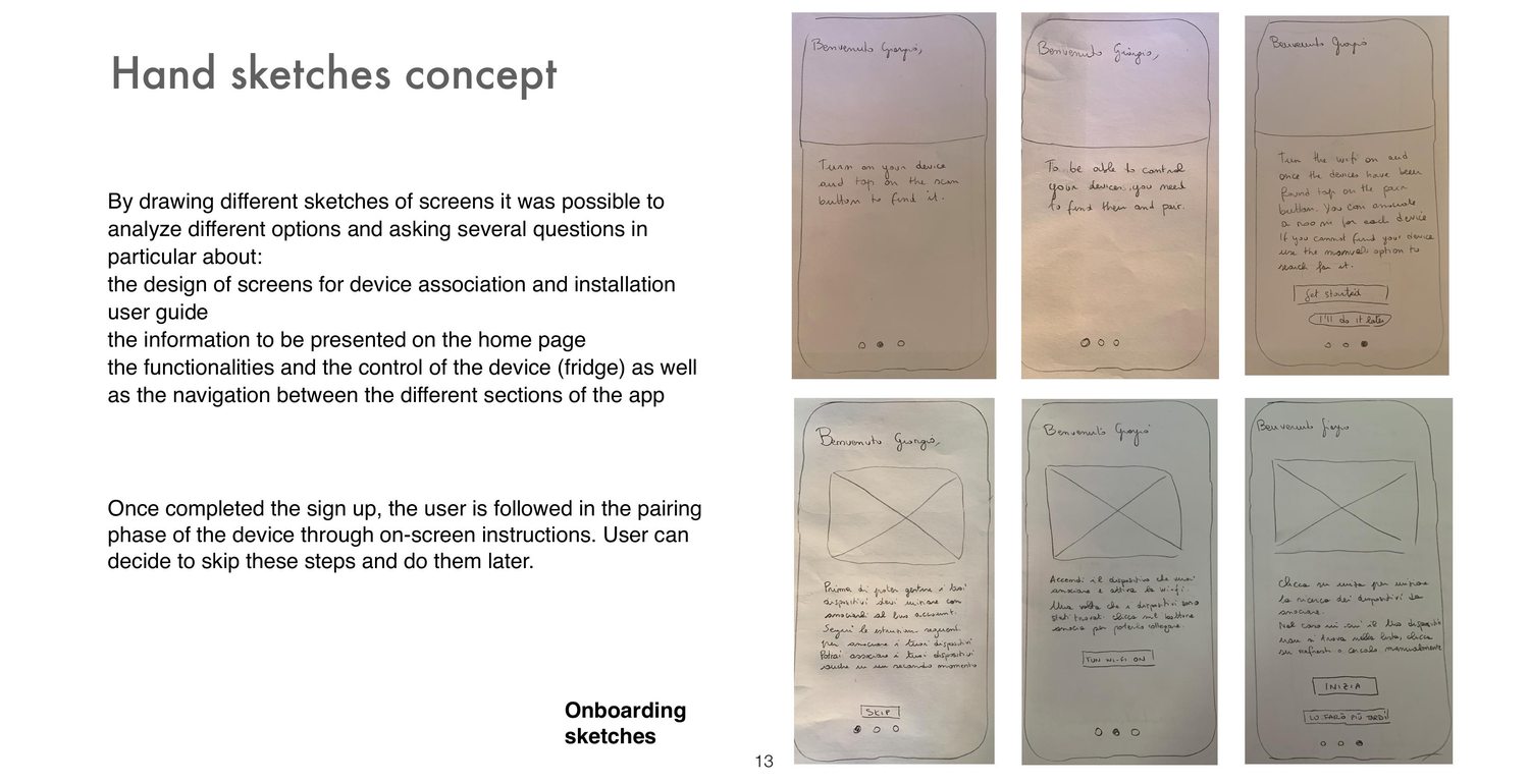
Drawing by hand was the fastest way to ask the awkward questions: what belongs on the home page, how the device association is explained on screen, and how you get from a room to a single control.
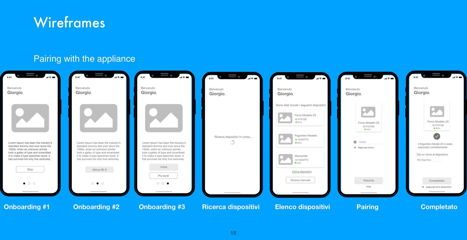
The onboarding and pairing flow, end to end: three onboarding screens with a skip, device search, the list of what was found, pairing, and confirmation with the option to name the appliance, assign it a room, or add another one.
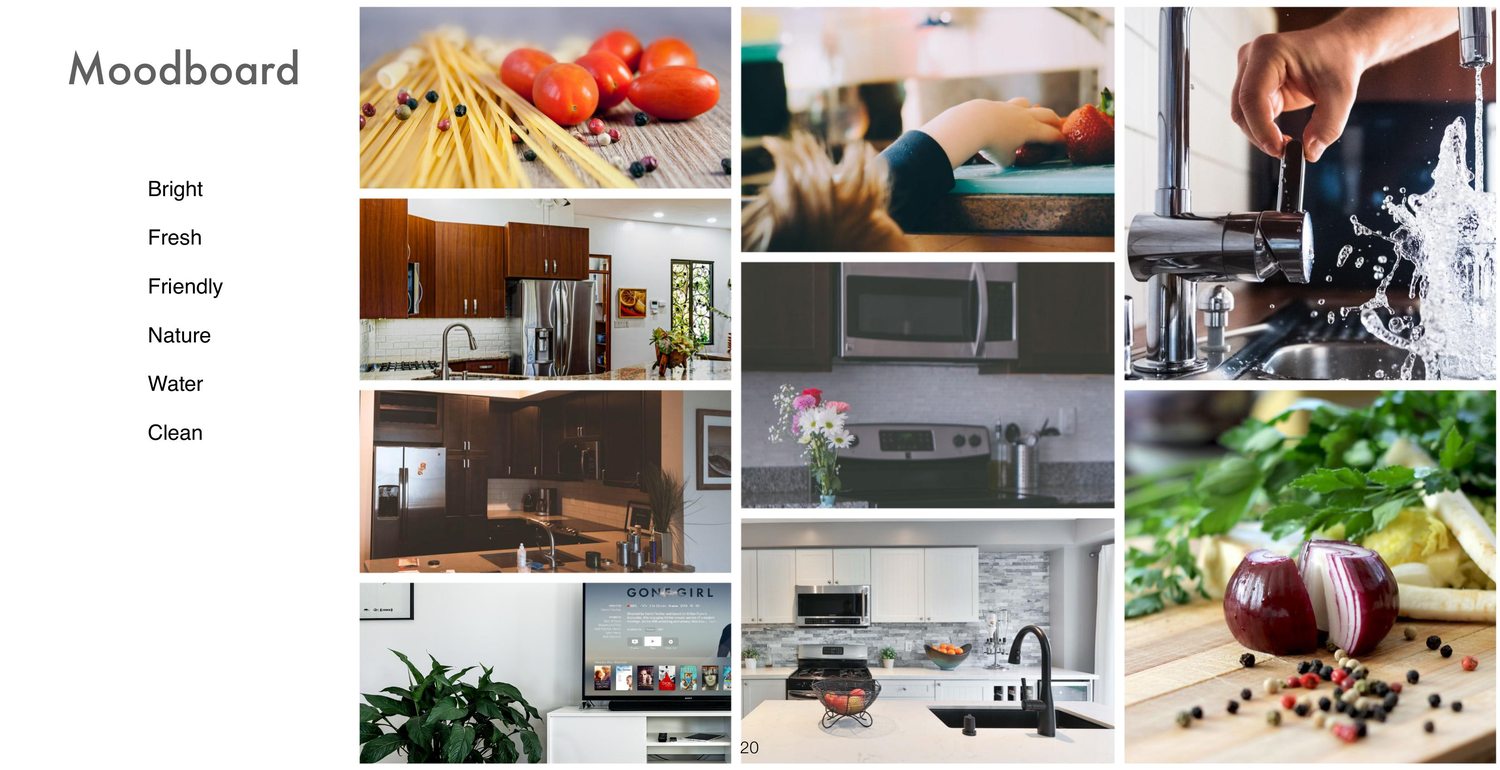
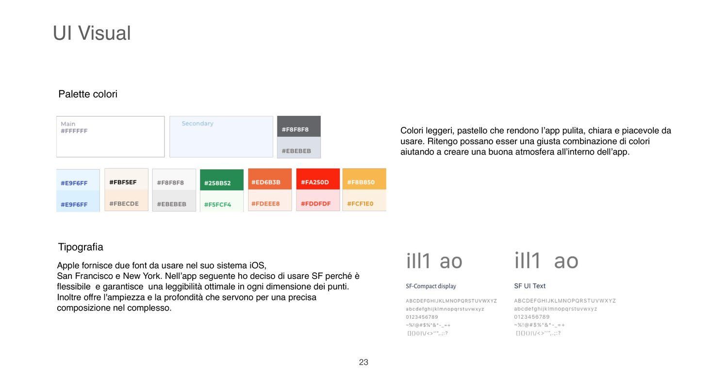
Four words held the visual work together: bright, friendly, natural, clean — cold, water, food, temperature. Light pastel colours to keep the app calm rather than technical, rounded corners, small illustrations, clear images, and motion used to confirm what the user just did and what state each device is in.
For type, San Francisco: it holds legibility at every size and gives the range needed for a dense dashboard.
The exercise resulted in a product direction covering competitive research, information architecture, onboarding and pairing flows, wireframes, and a high-fidelity visual direction.
The exercise ended at hi-fi screens, and the gaps were as interesting as the output. With more time — and with access to a real product range — I would have wanted:
Reading it back years later, the part I'd keep is the decision to argue with the brief in writing. The part I'd change is having decided who the user was without asking.